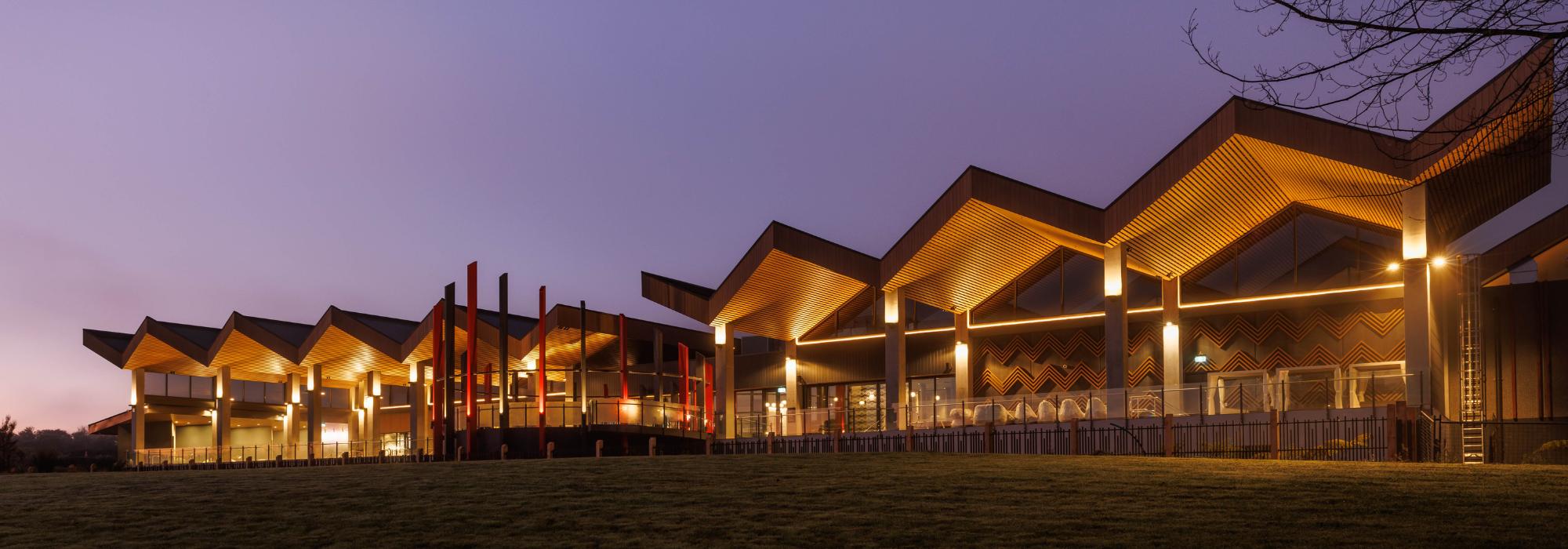
A two-year journey has culminated in the creation of a stunning new visual identity for Rotorua.
New Zealand Māori Arts and Crafts Institute’s lead designer Stacy Gordine and General Manager Eraia Kiel worked with design agency DesignWorks, to develop a tohu (symbol) that represents our city.
Destination Rotorua’s Head of Marketing and Insights Jo Holmes said the new tohu will provide a strong visual cue to bring the destination’s brand identity to life.
“When you look at some of the best known destination brands around the world, the logos are all based on physical structures or natural elements - think of the Eiffel Tower or Sydney Opera House featured within the Paris and Sydney logos.
”We were so lucky to be able to work with local designers Stacy and Eraia, who have created a tohu inspired by the Pōhutu geyser located in the Whakarewarewa thermal valley.
“They’ve also gifted the cultural narrative behind the tohu, which acknowledges the eight beating hearts of Te Arawa and the 18 lakes found within the iwi rohe. The tohu symbolises the connection between earth and sky, past to the present, physical to spiritual. And best of all, it comes from within this place, from Rotorua designers.”
The process to develop a unified place brand involved consultation with a wide group of stakeholders to define what makes Rotorua a special place to live, work and visit. Particular emphasis was placed on consulting with representatives from Te Arawa throughout the entire process to ensure the brand reflects the unique nature of the destination and Te Arawa’s vision for the future.
“Everything we do to promote the destination is now linked to a single defining idea: It’s all found within Rotorua. That challenges us to always look beyond the surface, searching for the deeper stories, most meaningful experiences and putting our people in the centre.”